Banner Blindness and Ads That Are the Scenery
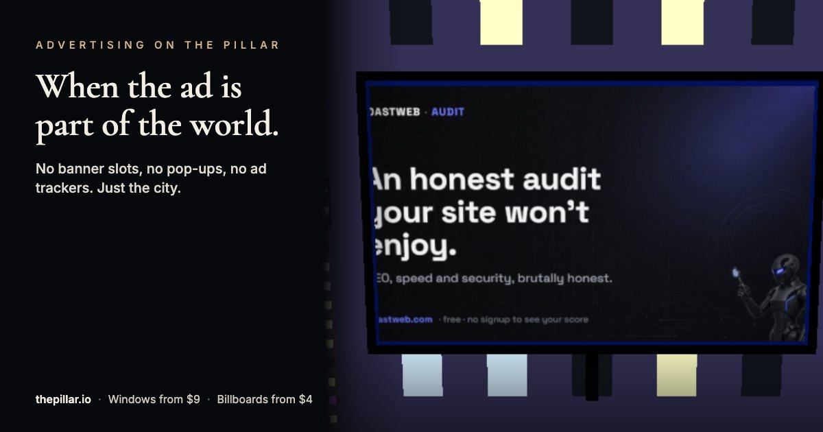
Banner blindness is the habit of looking past anything that resembles an ad, and years of eye-tracking research say it isn't going away. One way around it is to put the ad inside whatever visitors came to look at. That's how The Pillar works: its ads are the windows of an 80-floor tower and the billboards of a 3D city game, at $9 to $392.85 a month for a window and $4 to $8 for a billboard.
In one line: Banner blindness means visitors ignore content that looks like an ad or sits where ads usually go. Ads that are part of the scene avoid the box that visitors have learned to skip. On The Pillar, the ads are the tower's windows and the city's billboards, with no pop-ups, no autoplay and no ad-network trackers.
What banner blindness is
Banner blindness is the name for something every web user does without thinking: looking straight past anything that resembles an ad.
Most of the well-known research on it comes from the Nielsen Norman Group, which has run eye-tracking studies on it for years. Their 2018 report, "Banner Blindness Revisited" by Kara Pernice, sums up the finding in one sentence: "Users have learned to ignore content that resembles ads, is close to ads, or appears in locations traditionally dedicated to ads."
That sentence covers more than banners. It names three triggers.
Placement. Anything in the spots ads usually occupy, such as the right rail of a desktop page or a strip across the top, gets skipped, whether it's an ad or not.
Looks. Anything styled like an ad, with animation, a bright box or a stock-photo look, gets treated as one.
Neighbours. Anything sitting next to an ad gets ignored along with it, even when it's useful content.
If you run a website, the third trigger should worry you most. A real call to action placed beside an ad slot can vanish with it. And if you buy ads, all three triggers work against you before anyone has read a word of your copy.
How the web taught people to skip
Nobody is born skipping ads. Visitors learned it, one interruption at a time.
Most websites put their ads in a small set of predictable places: the header strip, the sidebar, between paragraphs, in a box that floats up from the bottom of the screen. After seeing the same layout a few thousand times, readers stop scanning those areas at all. Their eyes go to the article, the product or the search result and route around everything else.
Interruptions made it worse. Pop-ups that cover the page, videos that play with the sound on, interstitials that block the content you clicked for: each one trained visitors to dismiss first and read never. Cookie banners added another box to close before anything happens.
For an advertiser, that creates a strange situation. You pay for an impression, the ad loads, it sits on the screen, and it may never be looked at. Ad platforms count it anyway, because "served" and "seen" are different numbers and only one of them is easy to measure.
For anyone who builds websites, the lesson runs the other way too. If part of your own page looks like an ad, visitors will skip it. Promo strips, flashy sale boxes and anything that blinks get the same treatment as the ads they resemble.
Where banner blindness hits your own site
You don't need to sell ads to suffer from banner blindness. Your own page can trigger it, and the cost is your own content going unread.
Keep calls to action out of the right rail. That column has been ad territory on desktop for so long that a sign-up box placed there gets skipped like an ad, however useful it is.
Don't animate what matters. A pulsing badge or a rotating carousel looks like advertising. If your main offer moves, visitors may treat it as an ad and look away.
Give promos some distance from real ads. If your site runs third-party ads, a promo for your own product placed beside them gets ignored along with them.
Style offers like content, not like banners. A plain paragraph with a link next to the text a reader is already reading gets more attention than a bright box with stock photography.
And check how visitors really use the page. Click maps and session recordings show which parts of a page get ignored. If an important element gets almost no clicks, banner blindness is one of the first explanations to test.
Two ways around it
There are two broad ways to show a brand to people who skip ads.
One is to make the ad look like content. Sponsored articles, native ads in a feed and posts from paid creators all work this way. It can work, but it depends on blurring a line that readers care about, and it needs clear labels to stay honest.
Another is to put the ad inside something people want to look at. A billboard along a scenic road, a logo on a racing car, a sponsor's name on a stadium: none of these sit in a box beside the content. They're part of the view. Spectators see them while watching the race or the match, and the brand happens to be in view.
That second approach has a long history offline. Online it's rarer, because websites are pages, and a page only has so many places to put things.
A website that isn't a page
Picture a free 3D city that runs in the browser. That's The Pillar. You open thepillar.io and you're in a city: you can walk the streets, drive a car, fly a helicopter or a plane, and glide in a wingsuit, with other players in the same city at the same time. There are loot boxes with cartoon weapons, a daily treasure hunt, and an 80-floor glass tower in the middle of it all.
Here, the ads are the city. Every one of the tower's 1,920 windows can carry a brand's logo, and 187 buildings carry billboards that can show a logo or a full banner. A visitor doesn't see an ad slot next to the game. They see a tower with logos on its windows and streets with signs on the rooftops, the same way they'd see signs in a real city.
Nobody has to stop and close anything. A player driving down the street passes billboards because they're on the street. A player riding the elevator up the face of the tower passes windows because they're on the tower. If someone wants to know more about a brand, they tap its window or billboard and a panel opens with the brand's name, a one-line pitch, a short pricing line and a link. Nothing opens unless they ask.
I built The Pillar, so weigh my view accordingly. I can describe exactly how it's put together, and for banner blindness the design is what counts.
How the design avoids the three triggers
Go back to the three triggers from the eye-tracking research and compare them with what a player sees.
Placement. There's no right rail and no header strip. The ads sit on buildings, which are the main thing on screen. The tower is the first thing every visitor sees when the page loads, and players spend their time moving through the streets where the billboards are.
Looks. A window with a logo looks like a window with a logo, which is what a skyscraper in a city looks like. A billboard on a roof looks like a billboard on a roof. Nothing animates to get attention, and nothing flashes.
Neighbours. The content next to an ad is more city: other buildings, other windows, cars going past. There's no article for the ad to steal attention from, so it doesn't drag anything down with it.
None of this guarantees attention. A player racing a car through the city may not read a single sign. But the ads aren't in the places people have spent twenty years learning to skip, and that's a better starting point than most placements on the web.
Billboards in a city, real and 3D
A city billboard on The Pillar has more in common with a roadside billboard than with a banner ad. Both are part of the view. Both get seen by people on their way somewhere. Neither interrupts anything.
The differences are worth knowing before you compare them.
A real billboard can be seen by thousands of drivers a day, mostly for a second or two, and it costs far more per month than any spot on The Pillar. You can't click it, so you measure it with brand surveys or promo codes.
A billboard on The Pillar is seen by far fewer people, because the site is new. But a player can stop, fly up to it, tap it and open your link in the same moment. The billboard has a link, a view counter and its own share page, which no roadside sign can offer.
On reach, the roadside billboard wins easily. Compare them instead on price and on how close the sign is to a click: a few dollars a month for a sign that's one tap away from your website.
What's missing on purpose
A few things you won't find on The Pillar, and why they matter to an advertiser who cares how their brand is shown.
No pop-ups or autoplay. Ads never cover the game and never make a sound. The only motion is the scene itself.
No ad-network trackers. The Pillar doesn't run trackers that follow visitors to other websites. Your ad is an image in a 3D scene, everyone sees the same thing, and nobody gets retargeted because they drove past your sign. The site uses ordinary analytics to count its own visits, as most sites do, but nothing builds an advertising profile of the people who see your ad.
No click auctions. You don't bid. A window costs $9 a month on the bottom floor and rises about 4.5% per floor to $291 on floor 80, with corner panes 35% higher, so the top corner is $392.85. Billboards cost $4 to $8 a month. The price on the window is the price charged every month through Stripe, and you can cancel any time.
No destruction. The game has rockets, mines and a flamethrower, and players use them on cars and trees. They never touch the windows or the billboards. The code even keeps scorch marks off the billboards.
A window is a licence to show your ad, not property. In The Pillar's own words, a window is a licensed ad pane on its 80-floor tower, not real property and not a security.
What it can't do
Putting ads in the scenery solves one problem and leaves others open. It would be misleading to skip them.
The audience is small. The Pillar went live in September 2026. It's a new site with a growing audience, and nobody can promise an advertiser a number of impressions or clicks. If you need reach this month, a large ad network has more of it.
There's no targeting. Every visitor sees the same city. You can't show your billboard only to people in one country or one age group, and you can't retarget anyone.
Measurement is basic. Each window's panel has a view counter that goes up every time someone opens it. It starts at zero and counts real opens only. For clicks, you add tracking tags to your link and read them in your own analytics. There's no dashboard of impressions.
There's no self-serve editing yet. Once you've paid, your logo, pitch and pricing line stay as they are for the month. Link to a page you control, and change that page instead.
For a brand that wants a cheap, fixed-price placement that doesn't fight its audience for attention, those limits are acceptable. For a brand that needs precise targeting and guaranteed volume, they aren't.
Fix the page before you buy the ad
Banner blindness research stops at the click. Everything after it depends on your page.
Every ad, on The Pillar or anywhere else, sends people to a page. If that page is slow, broken on phones or confusing, the click is wasted, and you paid to send a visitor somewhere they left in three seconds. Visitors from The Pillar arrive on desktops and on phones, straight from a 3D game, with no patience for a page that's still loading.
Before you spend anything on an ad, check the page it points to:
- ▸Speed. How long until the main content shows, and does the page jump around while it loads? Google's Core Web Vitals (Largest Contentful Paint, Interaction to Next Paint and Cumulative Layout Shift) are a good standard to measure against.
- ▸Mobile. Can you read it on a phone without zooming, and can you tap the buttons with a thumb?
- ▸The first screen. Does the visible part of the page, before any scrolling, say what you sell and what to do next?
- ▸Your own ad-like boxes. Banner blindness applies to your page too. If your main call to action looks like a promo strip, visitors may skip it.
- ▸The link preview. When you share the page, does it show the right title, description and image?
This is what RoastWeb does: paste a URL and it scores the page on speed, SEO, accessibility, best practices, mobile and security, then ranks the fixes by impact and explains them in plain English. The basic report is free and needs no sign-up. Run a roast on your landing page before you point any ad at it.
Setting up an ad on The Pillar
If you decide to try it, setup takes about ten minutes.
- ▸Open thepillar.io. Tap a window on the tower, or head into the city and tap a billboard.
- ▸Sign in with X. You need an account to rent a spot, though not to play.
- ▸Paste your site's address. The Pillar reads your page's tags and fills in your name, logo and a short pitch, which you can change.
- ▸Upload a cleaner logo or banner if the automatic one looks soft (PNG, JPG, WebP or SVG, up to 400 KB). On a billboard, choose a logo or a full banner and drag it in the live preview until it's framed.
- ▸Write a pitch of up to 140 characters and, if you want one, a pricing line of up to 80.
- ▸Add tracking tags to your link, for example ?utm_source=thepillar&utm_medium=window. The Pillar keeps your link exactly as you type it.
- ▸Pay through Stripe. Your spot lights up a few seconds later.
Every lit spot gets its own share page at thepillar.io/w/ plus its id, with a link preview card showing your logo, name, pitch and floor. Post that link on your own channels; a "we're on a skyscraper in a video game" post gives your followers a reason to look.
Writing for a glance
An ad in the scenery gets seen in passing. Write for that.
Logo. Players see it from a distance, often while moving. A bold mark on a transparent background holds up. Thin lines and small text don't.
Banner. Show one thing, large. A single product or a single headline of three or four words reads at a distance; a paragraph doesn't. The city's default look is night, so avoid very dark backgrounds that disappear against the sky.
Pitch. Write it for someone who has never heard of you. "Website audits in plain English" tells a stranger what you do. A slogan tells them nothing.
Pricing line. Put a real number in it. "Free plan, Pro from $19 a month" answers the question every visitor has before they click.
Colour. The city glows with neon against dark blues and purples at night. Logos and banners in light, warm or saturated colours stand out against that; navy and black blend into it.
What to measure
Give it a full month, since the first week is mostly your own followers checking it out after you post the link. Then look at three numbers.
First, the view counter in your spot's panel: how many times someone opened it. Second, the visits tagged with your utm_source: how many clicked through. Third, conversions on those visits: whether the page did its job.
Opened but rarely clicked usually means the pitch or pricing line needs work. Clicked but not converting points at the landing page, which is where a roast helps. Rarely opened at all? Try a different floor next month, or a billboard closer to where players drive.
At $4 to $21 a month for a billboard or a low window, one customer usually covers the month. If the numbers don't get there, release the spot. It takes about a minute, and your ad stays up until the end of the month you paid for.
The short version
Banner blindness means visitors skip anything that looks like an ad or sits where ads usually go. Louder ads only feed it. A brand placed inside something visitors want to look at sidesteps it. The Pillar does that by making the ads part of a 3D city, with no pop-ups, no trackers and a flat monthly price, at the cost of a small audience and basic measurement. Whatever you choose, fix the landing page first, because an ad can only be as good as the page it sends people to.
The full price list, billing rules and setup guide are in The Pillar's advertiser guide.
Frequently Asked Questions
What is banner blindness?
Banner blindness is the habit of ignoring anything that looks like an ad. Nielsen Norman Group's 2018 eye-tracking report found that "users have learned to ignore content that resembles ads, is close to ads, or appears in locations traditionally dedicated to ads."
How do you advertise without triggering banner blindness?
Put the ad inside something people want to look at instead of in a box beside it. On The Pillar, ads are the windows and billboards of a 3D city game, so players see them as part of the scene rather than as a slot to skip.
How much does advertising on The Pillar cost?
Tower windows cost $9 to $392.85 a month, depending on the floor and whether it's a corner pane. City billboards cost $4 to $8 a month. There's no bidding, and you can cancel any time.
Does The Pillar track the people who see my ad?
No. The Pillar doesn't run ad-network trackers, and ads don't follow anyone to other websites. You get a view counter on your window and whatever your own tracking tags record when people click your link.
What should I check before running any ad?
The page the ad links to: load speed, Core Web Vitals, how it works on phones, whether the first screen says what you sell, and whether your link preview shows the right title and image. A free RoastWeb report checks all of these in one scan.